UA
 RU
 EN
 Website
Web development
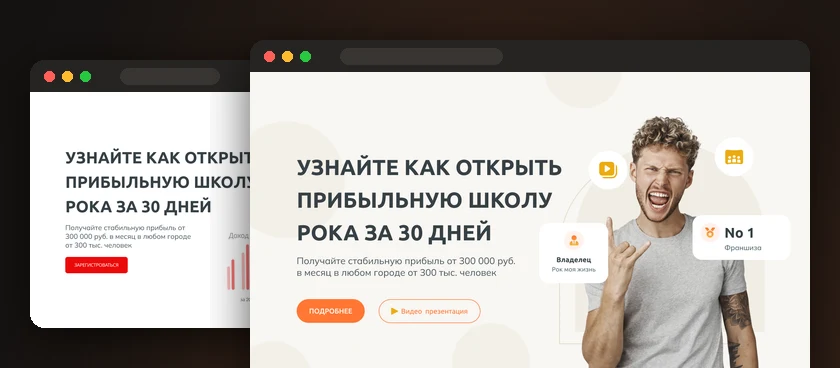
Rockstar franchise master class landing page
A sign-up landing page for an online master class on opening a Rockstar franchise rock school: two design versions, speaker, agenda and a form with gifts.
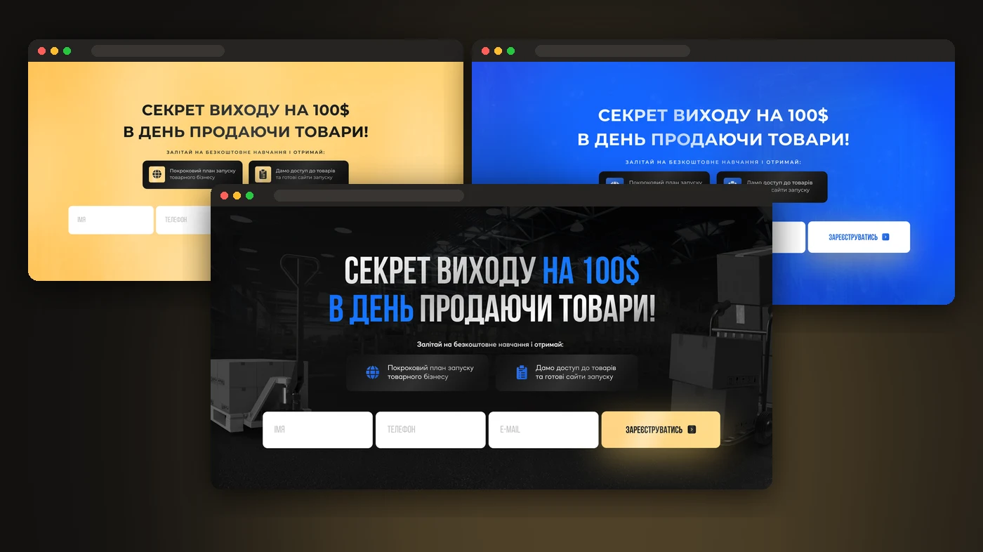
A sign-up landing page for a free product business course: 4 hero variants for ad tests, 6 lessons, a speaker, countdown timers and 4 sign-up forms.
The author of a product business course was recruiting students for a free course through ads. The hero screen drives the cost of a sign-up, so we made four hero variants with the same offer but a different look, so ads could be tested and the cheapest one kept.
The main version is dark, with a warehouse photo and large condensed headings, while blue and yellow accents highlight the key points. The sign-up form sits right on the hero, so people can register without scrolling. Below come what students get, a six-lesson practical programme, the speaker and graduate reviews.
The sign-up form appears four times — on the hero and in three timer blocks — so people can register from anywhere on the page. A “Hurry, the free course won’t wait” timer and 4 secret sign-up bonuses add urgency, while the form asks only for a name, phone and email.
Four hero variants let ads run on the same offer while comparing the cost per sign-up by colour and style: dark premium, muted, bright yellow and deep blue. The rest of the page is identical, so any difference in results shows the impact of the hero itself.
The course author got a sign-up landing page with four hero variants, a form at every step and urgency timers. Ads can be tested on every variant and scaled on the one with the cheapest sign-up.
We’ll build a sign-up page with several hero variants, forms, timers and tracking — and launch your ads.